
I hate
Metro UI
The metro ui (I don't care if some company has said that Microsoft can't call it that because im not Microsoft) is probably the most major overhaul Windows has had since Windows 95 and for a 1.0 it sucks, here is some examples of what I hate
Interface
I have tested Windows 8 on every size monitor possible from the 15" to the 23" and metro looks terrible on all of them, its full screen, the icons are over sized and most of the colour schemes make me want to rip my eyes out, in the end I had to choose the black background with blue colour scheme.
The only form factor that I see this on is tablets and netbooks and the annoying thing is that metro apps can not run on 1024x600 which is the resolution that plagues all netbooks and tablets from 2010/2011 (and even 2012) and really I don't believe one bit that these apps do not run on these resolutions because this is heavily based off Windows Phone 7

Multi-monitor support
Metro ui lacks multi-monitor support, heres an example I open up the weather app and put it on my 2nd monitor, I go to open up the start screen on the 1st monitor and the weather disappears off the 2nd one. At this point i'm confused and thought maybe it crashed so I open it back up and put it back on the 2nd monitor and yet again it goes away, I tried everything including pinning it to the side and each of my attempts was foiled.
Microsoft most businesses are adopting a dual monitor setup because it boosts productivity and if you want businesses and developers to migrate to the metro uo then you HAVE to support dual monitors, I understand if this was released in 2006 but it wasn't
Fragmentation
Since the beginning of Windows 95 windows has been terrible at creating a consistent experience, in windows 95 some apps we're still using the 3.1 interface and the same applies with Windows 8, there is 3 menus.
- Classic- When I say classic I mean the menu with file, edit, view,etc. take Notepad for example, it has not changed since Windows 95, why wasn't this updated in Windows 7?. The calculator had an overhaul in Windows 7 but yet again it uses the classic ui instead of the ribbon ui
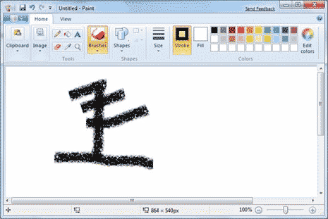
- Ribbon ui- In office 2007 Microsoft unveiled the ribbon ui, well since then they have been adopting other applications to use the same interface. First with windows 7 with wordpad and paint and now Windows Explorer with Windows 8. what annoys me is that you're TOO LATE, you just unveiled the metro ui, Your priority now is to make sure all the basic apps are using the latest interface, not to redesign it in the ribbon ui
- Metro ui- Everything is in full screen and options are in over-sized icons or dropdown boxes, etc, yea, yea, yea I just talked about that
Microsoft you need to speed up development, I understand if you were releasing versions every year but you're not, it's every 3 years. I had hoped that it would be different in Windows 8 but it's not
Device support
When I installed Windows 8, I went into device manager to find that a number of devices was not installed because of lack of drivers available, I would understand if these were old but they are about a year old. Microsoft it is 2012 and you have got all these manufacturers in your pocket, all releasing hardware that is compatible with Windows, the least you can do is make sure there is a central place where all manufacturers can submit drivers and then hardware would be supported out of the box or a driver can be downloaded immediately once connected to the internet through Windows update. With Ubuntu everything was supported except graphics drivers and they were a click away from being downloaded and installed, I understand that some may be unlucky but Ubuntu is free, Windows 8 is not
UAC 2.0

In windows 8 on top of the old UAC they have now added a new one called SmartScreen (Picture to the right) and this would popup everytime you click on an exe that is not in the Microsoft Store and it makes it all seem that these exe's are unsafe because they use words like Protected, Prevented, Unrecognised and Might put your pc at risk. As well as that it doesn't let you run the exe until you click more info. This is effective but you shouldn't have to freak the user out to make it effective
In Windows Vista I would be so annoyed because of the fact that UAC would popup a lot over the smallest of things, in Windows 7 it had improved but now its annoying again with Windows 8 and the fact they have both SmartScreen and UAC tells me how noneffective the old one was that they have to add another dialogue asking if you are sure, I clicked on it didn't I, just back off a bit
No comments:
Post a Comment